MoBIE
MultiModal Big Image Data Sharing and Exploration
Exploring segmentations
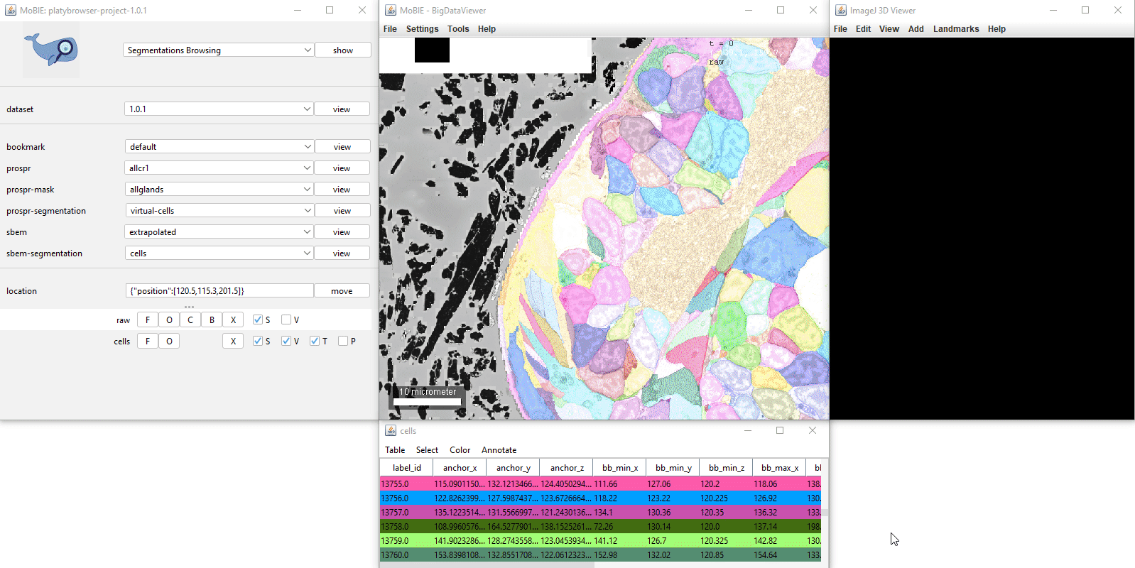
Adding a segmentation to the viewer, will display it as a coloured overlay on your image. If available, a corresponding table will also appear, where each row corresponds to one segmented object.
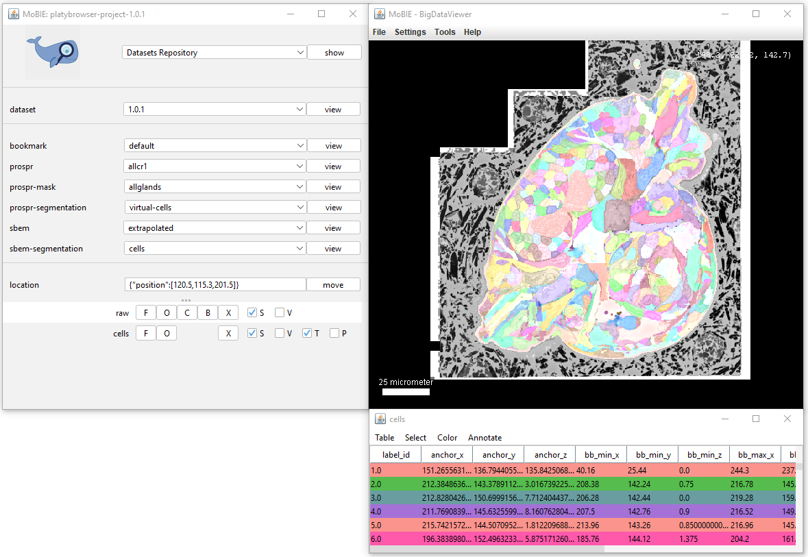
Both the table and segmentation overlay can be explored interactively:
Interacting with the segmentation in the viewer
All keyboard shortcuts are available by selecting Segmentations Browsing from the top dropdown menu of the MoBIE controls, and clicking the ‘show’ button.
To summarise:
- [Ctrl + left click] Select a segmented object. This will also cause the corresponding row of the table to highlight. If you have V ticked in the sources panel, it will also display it in the 3D viewer.
- [Ctrl + L] Randomly shuffle the colours of the segmented objects.
- [Ctrl + shift + N] Undo any segment selections.
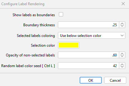
More options are available if you click the ‘S’ button in the sources panel:

This opens the Configure Label Rendering menu which allows you to change how labels are displayed in the viewer (see image below):
- Show labels as boundaries - display only the boundaries of segmented objects (see example image below)
- Boundary thickness - the thickness of the displayed boundary (if ‘show labels as boundaries’ is enabled)
- Selected labels coloring - Can change between ‘Keep current color’, or ‘Use below selection color’ allowing you to specify a specific colour to use.
- Selection color - the colour of selected labels if ‘Selected labels coloring’ is set to ‘Use below selection color’
- Opacity of non-selected labels - Changes opacity of non-selected labels
- Random label color seed [ Ctrl L ] - Changes the seed used for random colouring of labels.
| Configure Label Rendering dialog | Example of boundary rendering |
|---|---|
 |
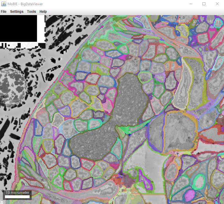 |
More options are available if you right click in the viewer:
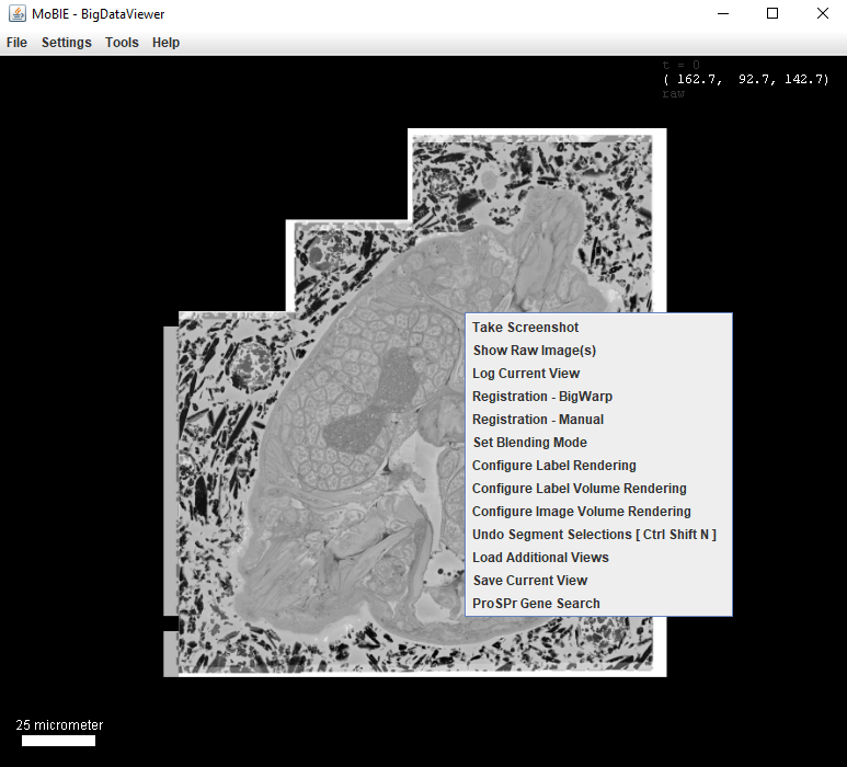
- Configure Label Volume Rendering Change resolution with which labels are shown in the 3D viewer.
- Undo Segment Selections [ Ctrl Shift N ] Same as Ctrl + Shift + N above.
Interacting with segmentation table
Clicking on a row in the table, will move you to the location of that object in the viewer.
Ctrl + clicking on a row, will also select that object.
The first column ‘label_id’ states the id of each segmented object from the image.
Adding more tables
Usually, the default table that appears with a segmentation only contains very minimal information e.g. the position of objects and their bounding boxes.
You can add more tables from the project, by selecting Table > Load Columns… and then Load from Project. This will make a dropdown menu appear with all available tables. e.g. in the example Platybrowser project there are tables for morphology statistics, gene expression and more…
New columns will be added to the right of table, and can be viewed by scrolling horizontally on the bar at the bottom of the table.
You can also add tables from your File System (see tutorial here)
Selecting based on table values
You can select segments based on values in the table by using the options under ‘Select’ in the menu at the top of the table.
- Select all Select all segments.
- Select equal to Select segments with a value equal to the input for a chosen column.
- Select less than Select segments with a value less than the input for a chosen column.
- Select greater than Select segments with a value greater than the input for a chosen column.
Colour by column…
Selecting Color > Color By Column… from the table menu will allow you to colour your segmented objects based on the values in a certain column. e.g. you could colour based on the value of a calculated statistic, or based on membership to different clusters.
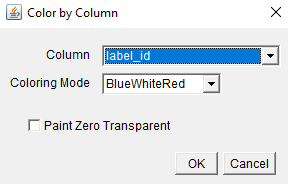
The dialog allows you to select the Column you want to colour based on, and a colouring mode. The final checkbox Paint Zero Transparent controls whether 0 values are transparent in the viewer or not.
Colouring Modes:
- BlueWhiteRed For numerical data - colour objects from blue (low value) to red (high value)
- Viridis For numerical data - colour objects based on viridis colour scale.
- Glasbey For categorical data - colour objects from Glasbey colour palette.
- A-R-G-B Column Used for custom colour schemes - needs a selected column where each entry is of the format A-R-G-B, specifying the colour for that row
For the palettes designed for numerical data, a popup will appear allowing you to change the minimum and maximum values for the colour palette. This is useful if you want to focus on / see differences in a smaller range of values.
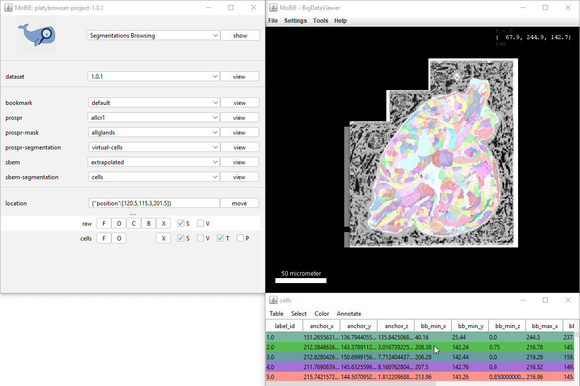
Plots
An interactive scatter plot can be made from any segmentation with an associated table. Tick the P checkbox on the row for that segmentation to open the plot dialog:
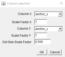
Select which table columns to use for the x and y axis, as well as any scale factors. This will open the plot:
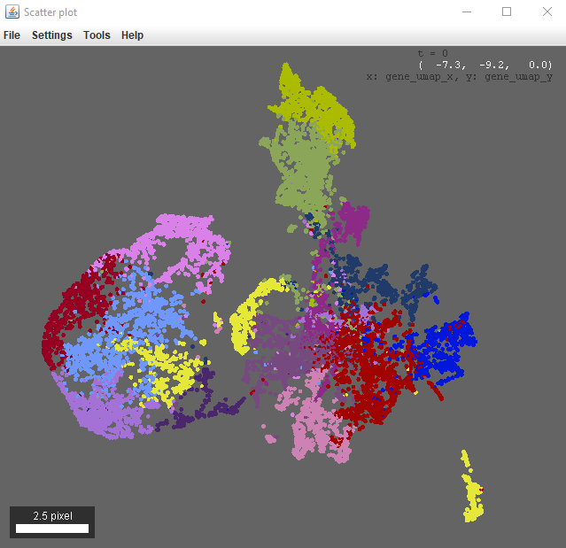
This plot will follow the color by column and selection settings given for the table, and is also interactive (i.e. ctrl+left click on a point to go there in the viewer).
There are more options if you right click in the scatter plot window. For example, you can configure the point selection to control how many points are selected / select all within a certain radius.
Saving tables
Tables can be saved by using Table > Save Table as… in the menu at the top of the table.
Specific columns can be saved by using Table > Save Columns as…
They will be saved as tab separated files.